
Art Design and Colour Meaning
People are becoming more aware about the power of colour to heal every aspect of their lives. We are surrounded by colour within natures flowers, trees, rocks, minerals and animals and we mimic these colours in our homes with soft furnishings, upholstery and ART. Here you will find a brief introduction about colour, it’s positive benefits and how it can enhance your environment.
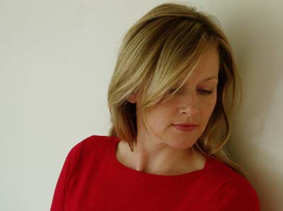
RED This colour has exciting & stimulating qualities, which is why it tends to be used in restaurants to stimulate the appetite and conversation; so a good colour to have in a dining room. Red is vibrant and gives us energy, it brings strength, warmth & energy and is associated with love. It is a yang colour and a person would wear this colour if they wanted to create an impression or feel confident and powerful in their surroundings, hence the term ‘power dressing’.

PINK When white is added to red it transforms it to Rose Pink, a softer more delicate colour than red it’s associated with the feminine energies and with unconditional love. It’s a colour associated with good health and well-being. A Good colour to have in a bedroom. It is associated with healing of the heart centre, the crystal stone Rose Quartz is a soft baby pink and is very often used for this healing purpose.

ORANGE The colour of joy, it has the power to encourage freedom and movement on all levels of our being. Its warm invigorating nature makes it a real mood lifter. It is also the colour of creativity so this colour would be a good colour to have in a study, work place or kitchen. Orange promotes confidence and a feeling of well being and that ‘everything is ok in my world’ so it is a good colour for encouraging and cultivating self worth.
YELLOW It is the colour nearest to sunlight. Its sunny disposition radiates warmth and inspiration. Yellow works with the intellect and mental inspiration, making it a beneficial colour to use in a study or place of learning. It is a happy colour and is often associated with summer, sun and jovial times. Children are very often drawn to this colour. It is a colour that calms our emotions and is associated with the solar plexus energy centre.
BLUE This colour promotes a sense of peace and relaxation, making it a good colour to have in a bedroom, meditation room or in a room set aside for relaxation. It is also the colour of communication so would be good to use in any communal areas of the home such as the dining room or lounge/sitting room. Depending of the shade of blue, it can have varying effects on ones being - turquoise blue is a powerful colour used in spiritual practices and is the colour of the stone ‘Turquoise’ which is revered by the Native American Indians. A deep electric blue is used as a powerful healing and protective colour and is used in many spiritualism churches. Baby blue can be a calming colour for children and would be a very good colour to use in a baby’s bedroom.

GREEN The colour of balance. In nature it is the colour of life. As the colour of balance it is able to bring stability to both mind and emotions. An unassuming colour that has a soothing tranquil quality so again this would be a good choice of colour for a living room or family room, encouraging harmony within the home.
VIOLET This colour is a combination of the masculine energies of red and the feminine energies of blue, which gives this colour the ability to balance and calm these two energies within the home or within an individual. Bringing both physical and spiritual strength and calming to those experiencing sleep difficulties this colour would be most beneficial in a bedroom setting.
People are becoming more aware about the power of colour to heal every aspect of their lives. We are surrounded by colour within natures flowers, trees, rocks, minerals and animals and we mimic these colours in our homes with soft furnishings, upholstery and ART. Here you will find a brief introduction about colour, it’s positive benefits and how it can enhance your environment.
RED This colour has exciting & stimulating qualities, which is why it tends to be used in restaurants to stimulate the appetite and conversation; so a good colour to have in a dining room. Red is vibrant and gives us energy, it brings strength, warmth & energy and is associated with love. It is a yang colour and a person would wear this colour if they wanted to create an impression or feel confident and powerful in their surroundings, hence the term ‘power dressing’.
PINK When white is added to red it transforms it to Rose Pink, a softer more delicate colour than red it’s associated with the feminine energies and with unconditional love. It’s a colour associated with good health and well-being. A Good colour to have in a bedroom. It is associated with healing of the heart centre, the crystal stone Rose Quartz is a soft baby pink and is very often used for this healing purpose.
ORANGE The colour of joy, it has the power to encourage freedom and movement on all levels of our being. Its warm invigorating nature makes it a real mood lifter. It is also the colour of creativity so this colour would be a good colour to have in a study, work place or kitchen. Orange promotes confidence and a feeling of well being and that ‘everything is ok in my world’ so it is a good colour for encouraging and cultivating self worth.
YELLOW It is the colour nearest to sunlight. Its sunny disposition radiates warmth and inspiration. Yellow works with the intellect and mental inspiration, making it a beneficial colour to use in a study or place of learning. It is a happy colour and is often associated with summer, sun and jovial times. Children are very often drawn to this colour. It is a colour that calms our emotions and is associated with the solar plexus energy centre.
BLUE This colour promotes a sense of peace and relaxation, making it a good colour to have in a bedroom, meditation room or in a room set aside for relaxation. It is also the colour of communication so would be good to use in any communal areas of the home such as the dining room or lounge/sitting room. Depending of the shade of blue, it can have varying effects on ones being - turquoise blue is a powerful colour used in spiritual practices and is the colour of the stone ‘Turquoise’ which is revered by the Native American Indians. A deep electric blue is used as a powerful healing and protective colour and is used in many spiritualism churches. Baby blue can be a calming colour for children and would be a very good colour to use in a baby’s bedroom.
GREEN The colour of balance. In nature it is the colour of life. As the colour of balance it is able to bring stability to both mind and emotions. An unassuming colour that has a soothing tranquil quality so again this would be a good choice of colour for a living room or family room, encouraging harmony within the home.
VIOLET This colour is a combination of the masculine energies of red and the feminine energies of blue, which gives this colour the ability to balance and calm these two energies within the home or within an individual. Bringing both physical and spiritual strength and calming to those experiencing sleep difficulties this colour would be most beneficial in a bedroom setting.

 closeups


